Studyflow
Flowtrainer
Visual & UX
Studyflow is recognized as one of the leading e-learning companies in arithmetics for high school and college in the netherlands. With over 120k active users and schools all over the country, studyflow had quite an impact on the way how students learn.
In 2017 I was assigned to a project called flowtrainer, an on the go word training app.
So we encountered some problems; studyflow is the biggest in arithmetics, but also adopted other subjects over time, like language. Schools had to buy licences per subject, so at last we wanted all the schools to start a pilot for language as well. The second problem was; there was no easy way, yet, to train words in the studyflow environment. And finally we saw that we lacked good experiences on mobile devices.
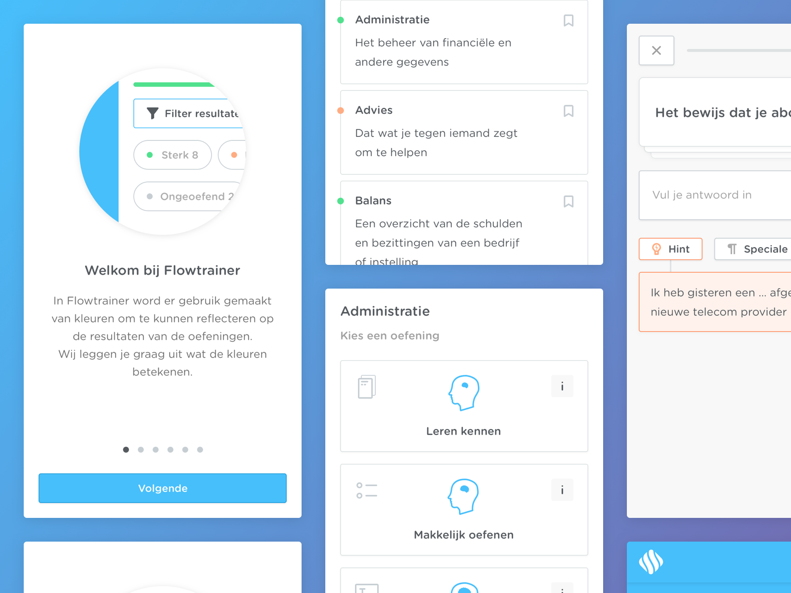
So after some team meetings, we found that the best solution was to create an on the go word training app called; flowtrainer. Which gives students the ability to train their language skill anywhere, anytime. Making use of the same gamification methods we use on the main platform, to make it an enjoyable and playful experience.
Insight in UX problem
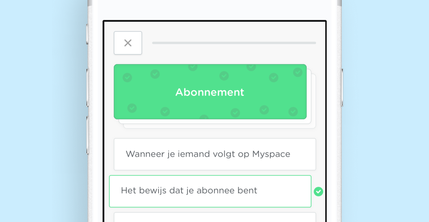
Does an user need an introduction screen before they start a practice (game)?
Argument for introduction screen;
when I choose a practice from the 'choose a practice' screen, the first thing I want to see is an introduction screen which tells what the practice is about and will act as an ease in into the practice. So you won't start the practice out of the blue.
Argument against introduction screen:
when students use the flowtrainer a lot, they don't want to see the introduction screen every time before they start a practice.
Explorations of solutions to that problem
We discussed the solutions and these three are the ones we gave the highest value:
Solution 1: version which will always show the introduction screen, when you choose a practice, to keep it simple and always maintain the ease-in.
Solution 2: with the introduction screen and an option to turn it of and on, so you won't have to see it in further usage.
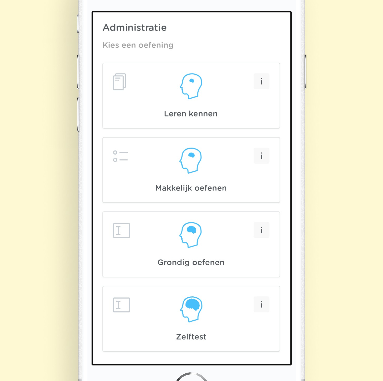
Solution 3: without introduction screen in the default flow, but you can navigate to this page by pressing the "I" information button.
Chosen solution
We took the middle road and we decided for solution 2 as for the MVP. We wanted to give the user the control to change the flow regarding to their level of usage of the app. Meaning; that if the student uses flowtrainer a lot, he or she can turn of this information screen. But if the student doesn't use flowtrainer a lot, but just from time to time, he or she will be able to get a pleasant ease-in and will be completely informed about the practice.