Bol.com
Visual & UX
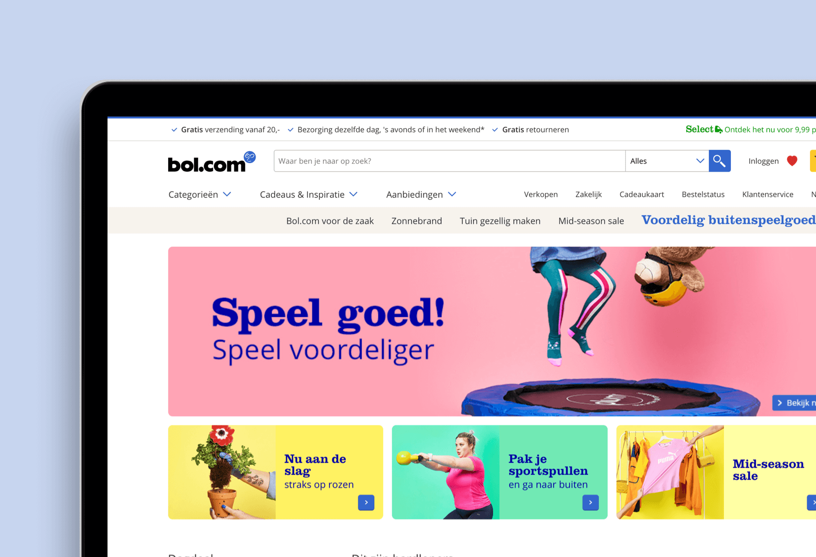
Being the biggest e-commerce platform of The Netherlands and Belgium, Bol.com has over 9 million customers and an annual revenue of 1.2 billion euro's. On behalf of resoluut, in 2018, I was assigned as a visual / ux designer to improve the customer service, Select (premium subscription model) and the my account environment. By tackling existing problems and designing new features.
Customer Service
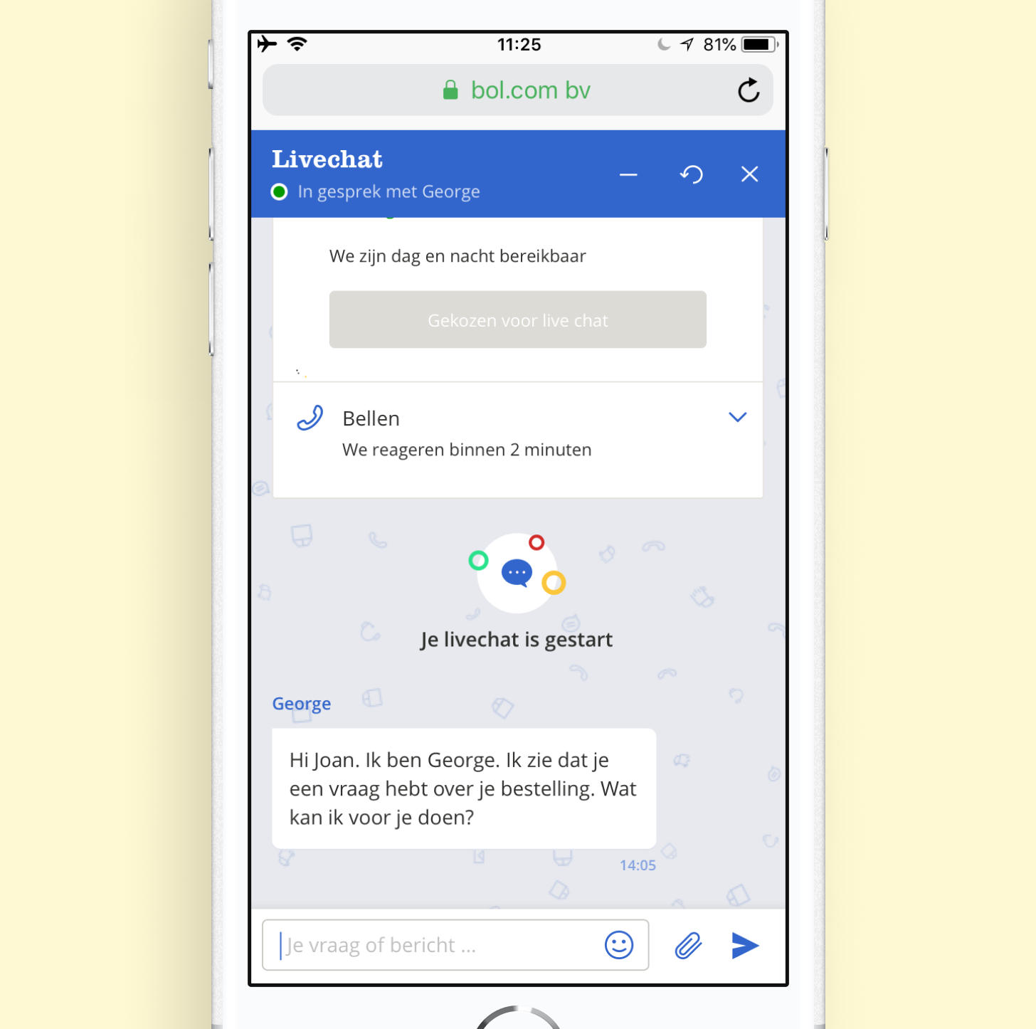
One of the challenges that Bol.com gave me was to redesign the customer live chat. By bringing everything to a digital platform it surely gives the user some solid customer service needs. The ultimate goal for the customer live chat was to create something that should be easy to understand and something that we could easily adapt and change whenever there will be new features along the way.
To maintain all the features that were requested, it was a task on it's own to make the full user flow feel consistent and natural. Including icon design, motion and visual hierarchy. For this design, we chose to keep the livechat in an endless scrollable page. So that you can always return to your session, and review previous conversations.
In the example above you can see that we made use of visual stamps (ex; “je livechat is gestart”), aka state events, showing inside a scrollable page what has happened. This is very useful whenever you will come back to the page after a while.
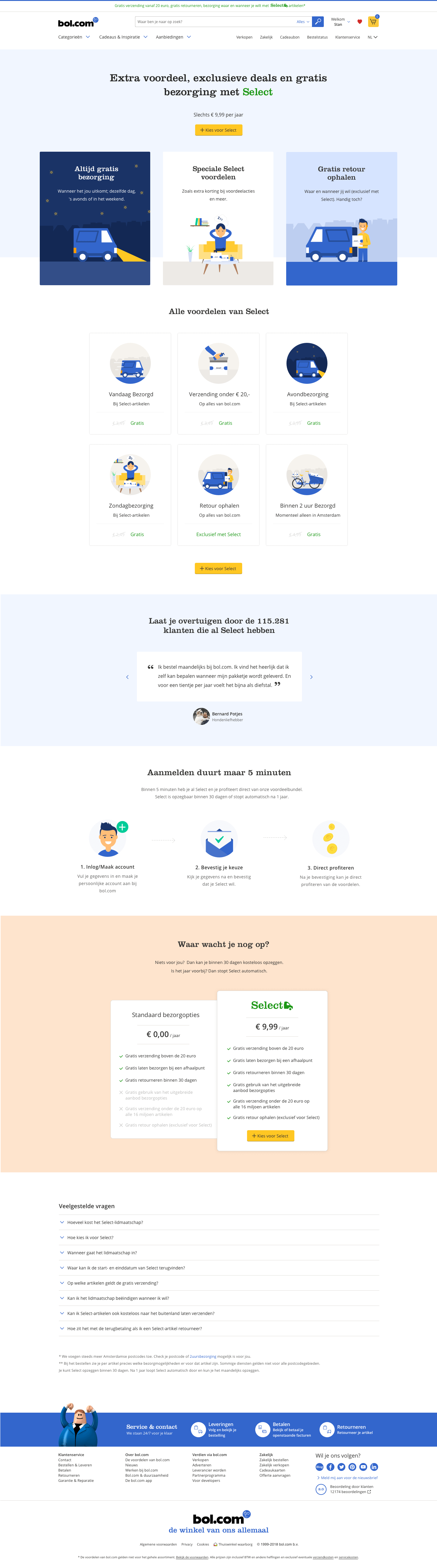
Select (Premium Subscription)
Just like Amazon has Amazon Prime, Bol.com has Select, a yearly subscription model that gives you a series of premium benefits, what will suit you well when you see yourself as a fanatic online consumer.
The challenge here, was to bring light to a quite fresh concept that Bol.com recently launched. We worked closely together with the analytics team to sketch out and experiment several idea's. To let the user know, in a subtle way, how beneficial this premium model can be.
Because we were still in an experimental phase of what the premium benefits were gonna be we found that we had to keep the design of the landing page as dynamic as possible, so whenever the benefits would change rapidly, we could still maintain the initial layout idea.